
Showing posts with label Print. Show all posts
Showing posts with label Print. Show all posts
22 Nov 2013
58. MENTORING SESSION ONE
A good time for some fresh response and perspective, this was a chance to re-present my progress so far and thus to clarify some things. The major point of exploration that came from it, to simplify, was the role of the reader. What expectations we hold as readers when presented with print matter, how we use and treat print and the subsequent habits we learn. In turn, how do these expectations shape the way the industry does print?
19 Nov 2013
57. MAGAZINE SPOTLIGHT: THE GREEN
Magazine Spotlight #04
The Green Soccer Journal www.thegreensoccerjournal.com


The Green Soccer Journal is a biannual magazine that takes an innovative, cultured and intelligent approach to the worlds most popular sport. The publication includes an eclectic mix of football culture and is built on a passion for the game, something which is shared by all of our contributors.
Displayed in a creative, visually stimulating format, we have worked with some of our favourite photographers, and writers to create a title that offers an alternative view on all things football.
The Green Soccer Journal www.thegreensoccerjournal.com


When issue number one arrived back in late 2010, I was so excited – a well-done magazine that addressed lifestyle and design in the context of football, or soccer as they have chosen to call. Recognising the diversity of football fans (which you must remember is without a shadow of a doubt the biggest sport in the country) and that we are not all pub-philic, beer-loving, foul-mouthed hooligans, the magazine presents a modern, mature outlook on the hot sport for a design-conscious audience (and indeed created by design-conscious, well, designers). So it was my perfect magazine and I felt that I represented the perfect readership.
I've purchased the first four issues, each of which highlights a theme to explore and includes valuable, journalistic interviews with some of the biggest names in football and accompanied by beautifully shot photography of unique perspectives away from the matchday furore. And it's very interesting to read, perhaps another good example of nailing an appropriately niche subject and doing it attractively.
However, it's not all good, because the writing and language was rather average, yet the price continued to go up from an initial £4 for Issue One to £8 for Issue Four, before doubling the latter for its current 'revamped' issue Number Five. And that's a bit too much for me and I've refused to purchase it. My intrigue is still very much there, I still want to pick up a copy and spend time with it, but I just think the price hike is too high, and certainly given the quality of what it's been thus far (which I reiterate wasn't at all bad, but fair at 5 or 6 pounds). They claim the magazine has taken a new, progressed direction with higher quality printing and denser issues, but I remain unconvinced. A £16 publication can't make grammatical errors in its own About passage, come on now. (I've underlined the childish error.)
The Green Soccer Journal is a biannual magazine that takes an innovative, cultured and intelligent approach to the worlds most popular sport. The publication includes an eclectic mix of football culture and is built on a passion for the game, something which is shared by all of our contributors.
Displayed in a creative, visually stimulating format, we have worked with some of our favourite photographers, and writers to create a title that offers an alternative view on all things football.
I don't disagree with its cultured and intelligent approach (not sure what innovation it's describing) but the second paragraph is frankly boring, just telling us it's superficially pretty – something I firmly believe, whilst of course important, should fruit naturally from its content and aims rather than an independent consideration point.
To summarise, it's a good magazine and one I would have (and have had) no qualms with, had it not called for higher scrutiny with its new price point, for which I do not think it sufficiently delivers. Shame.
18 Nov 2013
55. BACK TO VIDEO

I feel like I've hit a slight wall looking into print, not quite managing to hit any innovation as of yet though fascinating. I haven't looked at video as much yet and think I should reignite that interest and see if can lead me somewhere exciting. I suppose because print and video are so different, it's an interesting juxtaposition of moving image with something that is by definition not moving. I've got my new (ish) camera and I should experiment with video for sure. So let me just go do that, bye.
6 Nov 2013
50. INJOY JOURNAL
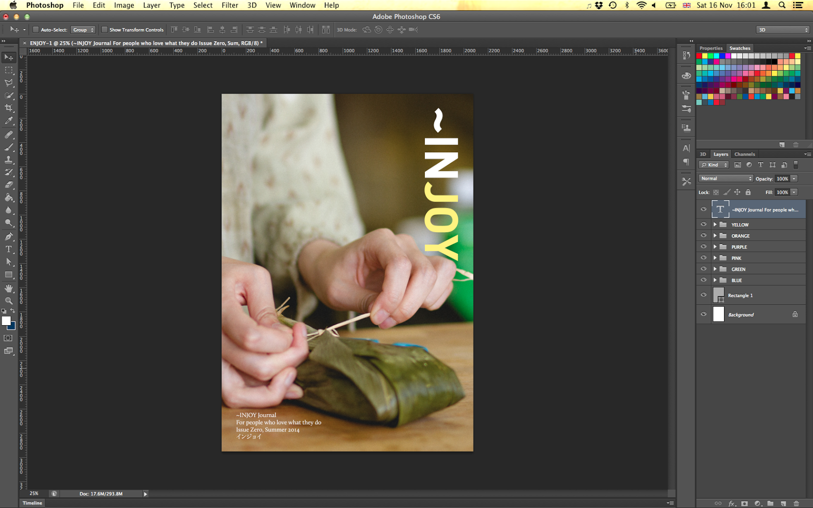
Having decided to adopt the idea of producing a publication tailored for people who love what they do, I wanted to quickly visualise something tangible and achievable. The title of ENJOY developed into INJOY to emphasise the rich state of happiness that passion can provide, being in a world of joy. It's a working title but I quite like it at the minute, ticking all requirements for the vision of my potential product, with an easily adoptable aesthetic, directly encapsulates the rationale and the optimum degree of wordplay. It's usually not very good to be so positive of my own work, I am aware, so let's not get too carried away.
I want INJOY Journal to showcase the joy and reward for people from engaging with their interests, to explore the methodology and reasons behind the interests and to present the existence of one common emotion shared and experienced in all walks of life and all forms of activity. The aim is to advertise the benefits of more positive, proactive, attentive attitudes toward what we seemingly 'love to do', and to portray a perhaps romantic allure for better enjoyment for everyone concerned. From professionals who love their jobs to enthusiasts who live and breathe their hobbies, members of fan clubs and appreciation societies, subject experts and critics, the opportunity for contribution is rather broad. And that should be good for me as a researcher and good for the readership as variety.
Still brewing, but I feel like I'm onto something. For the time being, I reckon I can accumulate some small, individual case studies of research and explore the gathering of information, with Design Research material possibly becoming quite important. Below is an example for a shop owner who runs a local delicatessen.


1 Nov 2013
48. MAGAZINE SPOTLIGHT: CAFFEINE
Magazine Spotlight #03
Caffeine www.caffeinemag.com


Available to pick up for free, Caffeine is the coffee lover's magazine, distributed to selected coffee shops around the country to serve as the 'stockists'. Of course it makes sense in terms of hitting the right readership and that is indeed how I found out about it. I've managed to collect issues 1 to 3 so far, with the current edition still eluding me.
Whilst short in relative terms of page count (probably aligning itself to the Stylist or Sport market) the content is presented with an air of expertise, finding the right, attractive quantity (and quality) of specificity. The publication includes journalistic articles, photography, reviews, essays and surveys to tell the Caffeine story and, really, provides everything you'd expect a 'coffee lover's magazine' to provide. Its advertising is smart and direct too, relevant for us the readers, spanning the likes of organic beans, espresso machines and coffee houses, all more helpful than irritating.
The magazine is a good example of narrowing into one specific subject and exploring the area in depth, with the challenge to present the specialist findings in a manner that is both appealing and amusing for all. Oh, and from spilling the beans to ground rules, I for one don't get bored of the cafe wordplay at all.
28 Oct 2013
43. LEGWORK TUTORIAL
A couple of days to refresh my mind after Monday's tutorial, spending full days out on the pitch with my boys (and girl) for Half Term.
I went into the tutorial with an idea fresh in mind from a bath one night (actually). The idea was as simple as: a magazine dedicated to people who love what they do. For me it makes total sense. My area of exploration thus far has involved the consumer's approach of how they (we) enjoy and how that interest is expressed, as well as how much interest is held – the act of enjoying and appreciating. So to create a document of real people showing real love what they do seems very fitting for my research and for my broader interests too. I saw a clear direction of how the publication would come together, imagining its features, content material, presentation and style.
I conveyed this to a good reaction, certainly as a starting point if not to be something more complete for my project. Key points raised by Laura were to question (and obviously answer) who/what/how my investigation should be conducted. And it's a valid thought to ponder, with it surely insufficient to merely do interviews and have a typical journalistic approach. I must remember my role as Designer throughout.
27 Oct 2013
42. MAGAZINE SPOTLIGHT: MONOCLE
Magazine Spotlight #02
Monocle www.monocle.com


"Keeping an eye on the world" since 2007, Monocle was launched by the man behind Wallpaper magazine, Tyler Brûlé. It's the one title I am a paid subscriber for, accepting their package of 10 issues + 2 papers + 1 tote bag + full online archive access + event invitations for an annual fee of £90. That price is actually more than what the cost of buying individual copies at the newsstand would be – a challenge to the standard pricing model where in-advance batch subscriptions tend to be better value. This is explained in the confidence placed on their services, a subscription being more than just a sales contract but as an act of buying into the brand. And Monocle's branding is one of the most complete around.
In partnership with sister design studio Winkreative, Monocle has rapidly achieved an iconic status of design and presence. The magazine aims to pioneer the ever-changing print and journalism industries, priding themselves with dense, in-depth and carefully selected content covering what they have identified as today's most relevant topics in affairs, business, culture and design (following a beautifully effective logic of ABCD). Significantly rooted across all parts of the world with offices, correspondents and sources, the work is assured to be genuine and unique, and certainly doesn't lack in quantity either as issue after issue they deliver seemingly larger, book-ish documents that I've currently collected the past 23 of.
Monocle has from the beginning laid out its version of aspirations and represents a high quality lifestyle in collaboration with their readership, and in recent years the company has expanded and ventured into radio broadcasting, physical shops and cafés to supplement the paper product and emphasise their values. Each outlet offers a different, yet equally asset of the brand and has proven to be a fine example of changing the relationship with its followers and the expectations for what a magazine title provides. At the very least, it's a successful challenge on what the relatively static print culture had been in the past couple of decades. Now, six years down the line, the format remains unchanged in its aesthetic design, which clearly reflects said aspirations and framework, using a sure template filled with beautiful first-hand photography and a masterful combination of Plantin and Helvetica.
It's a publication I constantly have much to take and learn from, in all aspects of its venture and one that has no doubt inspired my joy for the revival of print media.
25 Oct 2013
40. NOTES FROM THE MODERN MAGAZINE CONFERENCE
>> http://magculture.com/blog/?p=19333
Key reference link from the conference I introduced last week.
Key reference link from the conference I introduced last week.
24 Oct 2013
38. CONTEXT ABSTRACT RE-REWRITTEN DRAFT
The print industry interests me. Specifically, good publications interest me and, in turn, this raises the question of what makes a good publication and distinguishes it from the rest of what is a crowded market. This contextual report uses this as a starting point to explore 'goodness' – how it can be achieved and how it is appreciated. The report aims to establish why goodness is good for us, revolving around the hypothesis that a higher input of effort into caring and valuing work (for roles of both the creator and receiver) can lead to better enjoyment; increased enthusiasm, knowledge and passion all fuel the desire to engage even further, thus forming a beautiful positive feedback loop. Current examples will be discussed with research focussed about the strengths (and weaknesses) in good publications, exploring their journalistic style, material presentation and, perhaps most importantly, the chosen content matter.
21 Oct 2013


33. GAFFER TAPE + CARDBOARD WORKSHOP ONE
> Making the object


My object chosen was an A5 publication (magazine/journal/book type thing). I had a vision of peeling off thin layers of the collected cardboard to make smooth, delicate pages and to bind it neat and flush with dextrously applied Gaffa tape for a beautiful artefact. So that was the vision haha. My fingers ache...
16 Oct 2013
29. CONTEXT ABSTRACT
For my contextual report, I'd like to explore the relationship between maker and consumer, designer and user. My early project investigations have involved looking at the way in which 'work' is received and how it is valued by its audience. Key questions revolve around what we appreciate and why; what is it about quality that we appreciate, assuming that we do in fact appreciate it at all? I'd like to inspect how our attitude towards accepting and appreciating 'work' can directly relate to our emotions, whether our enjoyment or fulfilment can be optimised through work (effort) of our own. In turn, what can design do to dictate how the work is first perceived to trigger more attention by the recipient or user?
The print industry has seen a spike in new publications, albeit smaller in scale and target audience, each succeeding with a significant shift in focus from the digitally-converting mass-market titles. I believe that this focus is driven by greater care, which both serves more goodness for the reader as well as it invites more appreciation too.
This report itself acts as an attempt in encouraging you, the reader, to dedicate time with it and to make effort to experience its qualities – not only for my work as the designer to be fully recognised, but also for you to enjoy it better because of it.
This isn't the easiest thing to write right now, given that the subject area is still undecided, or at least not a stage at which I am optimally comfortable. And also because I thought abstracts tend to be best written at the end of the assignment itself; it's difficult to be specific about what the report will consist of. (I'm also 74 words shy.) But I understand the values that are held in writing something now, because we're at the start of the process, and that it's a good way to set off by actually doing useful work. I just don't want to be tied down to what I say now, that's all.
15 Oct 2013
27. MAGAZINE SPOTLIGHT: OFFSCREEN
Magazine Spotlight #1
Offscreen www.offscreenmag.com


First up in my spotlight series of good publications is Offscreen, a magazine exploring the people behind websites and apps – a smart concept looking at the offscreen lives of those who are behind the work we see on screen as well as more literally being behind screens all day for a living. I'm no coding enthusiast nor app developer, but it's still really interesting to be presented with how these people operate and to hear their outlooks on the broader notion of design and lifestyle.
Originally a web designer by trade, Kai Brach launched the first issue of Offscreen in early 2012. Feeling disconnected by the fast pace and the ephemeral nature of the digital world, after ten years of freelance work Kai wanted to create something more tangible. With Offscreen Magazine, he combines both his love for technology and the web, and the unique experience of printed magazines.
In the span of three months, Kai "converted" from a UI designer to an editorial art director, not only publishing and editing Offscreen but also designing the magazine from the ground up. As such, Offscreen is still a one-man operation, and a proudly authentic indie magazine supported by amazing contributors and curious readers. Kai hopes to reinvigorate printed magazines as a choice of media that provides a welcome break from our always-on society.
The words here, extracted from Offscreen's own About page, are eloquently put and provides a perfect introduction to the project's aims and purpose, which resonate with my feelings towards print as both an industry and as a reader who can appreciate good content. Printed magazines being a "unique experience" is vital to note, as an experience I am eager to find in its creation as well as the experience I feel as a reader. I think that Offscreen's statement of intent or self-instigated value is well communicated and on point for fitting into our lifestyle. It's therefore one of my favourite publications in the market, and has thus found itself first in my series of upcoming 'spotlights'.
11 Oct 2013
20. THIS

This arrived in the post along with my magazine subscription today, the Christmas Collection booklet by Monocle. I've done a couple of booklets for Victate, the layout and content of which I'm greatly satisfied with, but the final print has been lacking in my opinion. This, however, is absolute perfection. This little booklet is precisely what I want to recreate in form and weight. I'm not sure what paper type it is but I'm sure it's some sort of wove paper and its heavy weight just adds to the texture – it's goodness objectified.
19. A SELECTION OF MAGAZINE TITLES

Over the coming days and weeks, I'd like to spotlight some magazine titles that have been influential in my love for the media. I'm an avid reader of the recent rise in niche offerings and in the last couple of years, I've accumulated a decent selection of examples that is worthy of exploring and sharing. For now, here are some of the picks.
Monocle www.monocle.com
Apartamento www.apartamentomagazine.com
Offscreen www.offscreenmag.com
Kinfolk www.kinfolk.com
Printed Pages www.printedpagesmagazine.com
The Green Soccer Journal www.thegreensoccerjournal.com
10 Oct 2013
16. FOOTBALL TYPE

A wonderful example of merging separate interests into one project, Rick Banks has just launched a book exploring typography in football. Interests that I too happen to share, as well as printed publications of course, I bought myself a copy and it's arrived.
For this early part of the project, as we each try to pinpoint our own goal, we've been allowed to explore several interests independent to one another, all in the hope of finding something worthy or finding a valuable relationship between two or more of these interests. Print, video, music, typography, football – all interesting to me.
> Read more about the book on tlee. Black
4 Oct 2013
6. FINAL PROJECT
The two main draws of design discipline for me have been print and video. As different as they may be in form, these are my two equally strong avenues for my enthusiasm and fascination; my interaction with each of the media formats have been pretty constant and from a young age too. We've all grown up with printed matter surrounding us throughout all stages of life, from colouring-in books and the Mr Men series, studying with GCSE textbooks and revision guides, to of course reading newspapers and magazines each day. And as for video, if daily television isn't enough to justify familiarity, how about movies, home video footage or YouTube. With such overwhelming exposure to each of them, I suppose it makes sense that I've picked up interest in them.
I particularly like the element of storytelling in both of them, and the role of the designer to choose what story and how it is told. The spread layout of the magazine, the selection of imagery and style of writing are key components in determining the impression and even message left for the reader. In a similar way, video footage can be cut and sequenced differently to tell entirely contrasting stories, where again the power of the editor has huge effect on the viewer. One might call that manipulation, but whatever the terminology, it's pretty cool. Maybe it's this power, control and responsibility that I am attracted to, I'm not yet sure.
So my feeling right now is that I would be rather happy if I could spend my time exploring this.
Subscribe to:
Posts (Atom)